Billings Memorial Library: An Architectural Case Study
A Staple of the University of Vermont’s Campus Since 1883
Over the summer, our Austin architects went on our DK Studio Summer Retreat to explore the architectural styles of Vermont while also taking some time to berry pick and relax at our lakeside abode. During our stay, we toured the Billings Memorial Library at the University of Vermont and were struck by its rich history, use of line, and intricate woodwork. Of course, we had to sketch, photograph, and dive into some design research on this stunning structure! In this architectural case study of the Billings Library, we review the building’s history and design elements. It turns out that studying during vacation can be fun!
Billings Library/Photo Dianne Kett
History of the University of Vermont
First, let’s explore some of the University of Vermont’s history before we make our way across campus to the Billings Library. UVM was founded in 1791, when Vermont became the 14th state. While other universities only admitted men, UVM was one of the first American colleges to admit women students in 1871. The oldest building on UVM’s campus is the Old Mill Building, which was constructed in 1825. The Old Mill was built on the site of the original Main College Building, which was completed in 1801 and burned down in 1824. One of the next oldest buildings on campus is the Billings Memorial Library, which we are crossing the quad to go to next.
History of the Billings Memorial Library
The Billings Memorial Library was donated to UVM by Frederick H. Billings and designed by American architect Henry Hobson Richardson. The library was completed in 1883 and now holds a spot on the National Register of Historic Places for its rich history and unique design. When selecting architects for the project, doner Billings was picky. Dozens of architects were interviewed, and Billings selected Richardson for his previous work on the Winn Library in Woburn, Massachusetts. Billings wanted to model his namesake library after the Winn design and had confidence that Richardson could provide a new take on his original work. Billings originally budgeted $75,000 for the build. However, the final cost totaled over $150,000 due to the elegant wood carvings, stonework, and level of detail requested. Richardson sadly died shortly after project completion in 1886.
Billings Library Through the Years
Billings Library has been a staple of UVM’s campus since 1883. While the structure's design has been altered very little through the years, the library has struggled to keep up with the growing demand of the university. As early as 1908, the university newspaper began criticizing the library's functionality as other university libraries began innovating with new designs for book stacks and research rooms. By the 1950s, the library could no longer keep up. The Howe Library was built to replace Billings in 1961, and the Billings Library was converted to a student center in 1963. After a few decades, Billings once again became obsolete and was replaced with a new student center. However, an $11 million renovation in 2018 restored Billings to its former glory. The structure once again houses special collections for the university’s humanities and research departments.
Architectural Design Elements Used in the Billings Library
Monochromatic Color Palette
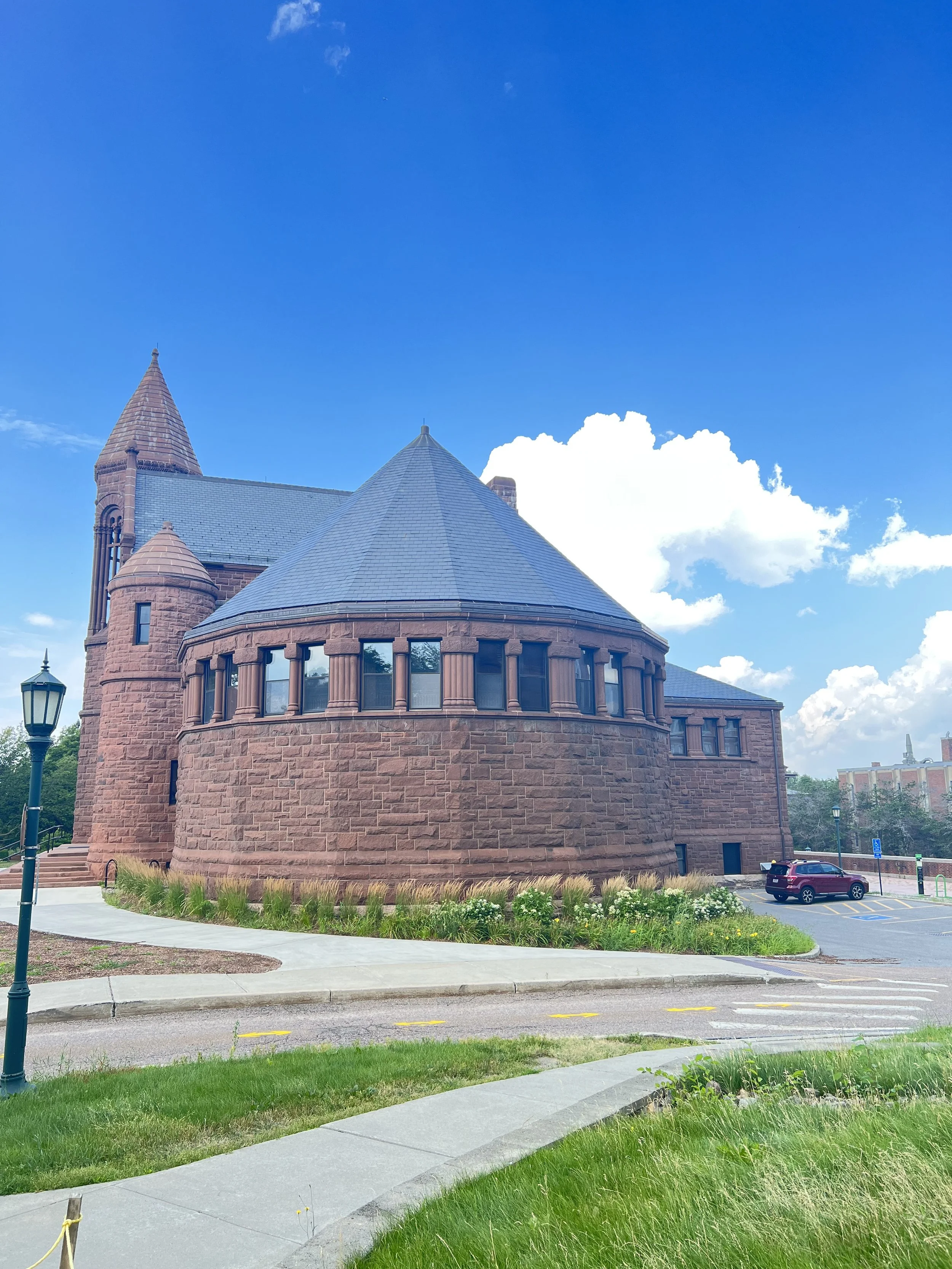
The Billings Library exterior is finished with a red Longmeadow sandstone used on the masonry and carved trim accentuating the tower, main entrance, and windows. Using the same material across the facade creates a monochromatic color palette, which is a current trend in residential architecture almost 150 years later! The monochromatic colors allow the form of the building to shine through.
Balance of Horizontal and Vertical Lines
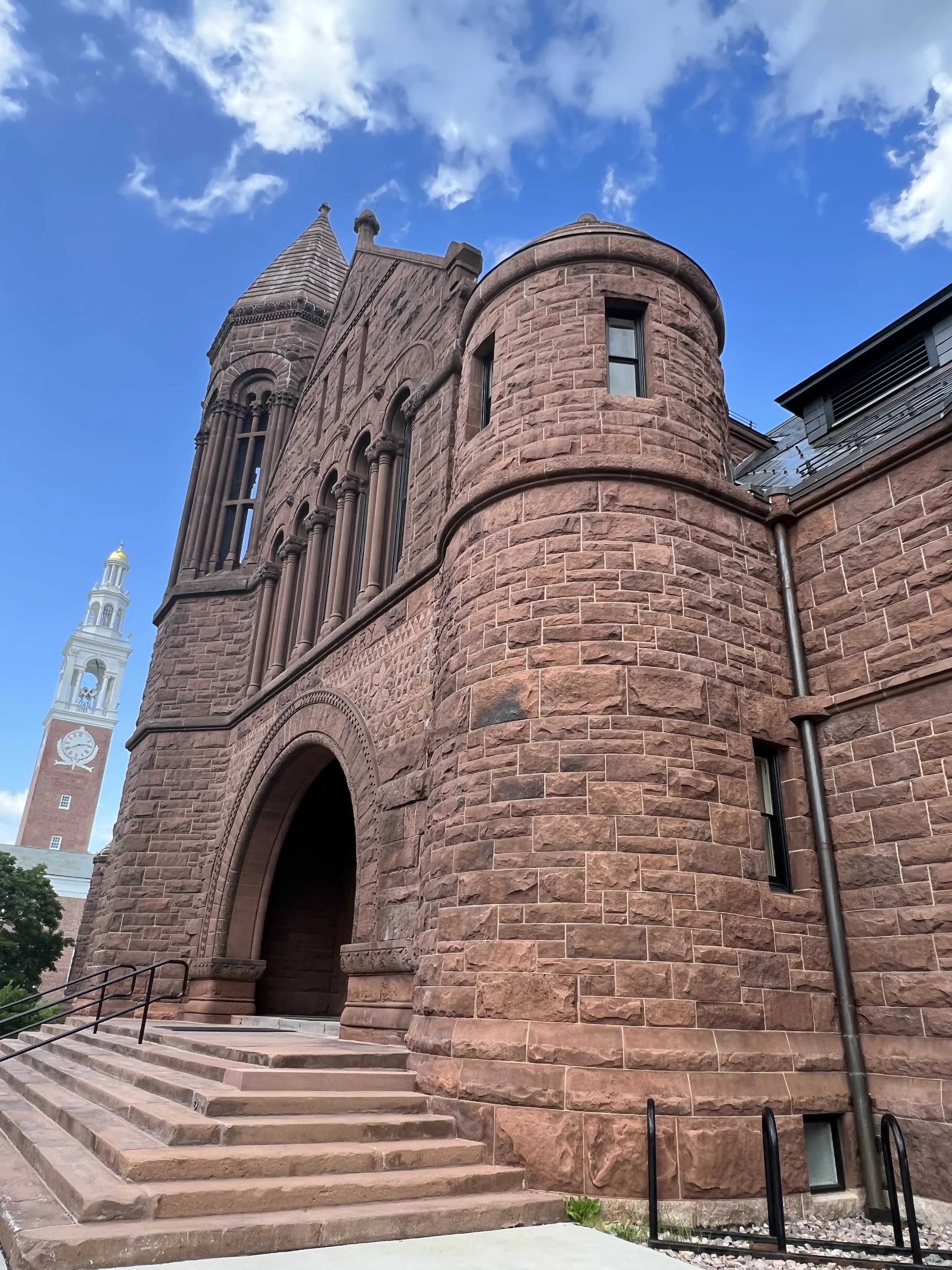
The design of Billings employs a strong balance between horizontal and vertical lines. The main structure is broad and is only broken up by short windows along the hip roofline, accentuating the horizontal line of the building. The front entrance is highlighted with contrasting vertical lines. A pitched gable with elongated arched windows creates a focal point to draw visitors inside, while the adjacent tower breaks up the symmetry for a dynamic effect. The front elevation design forms a defined point of entry and a dominating appearance that grounds this corner of campus.
“Pepperbox” Tower
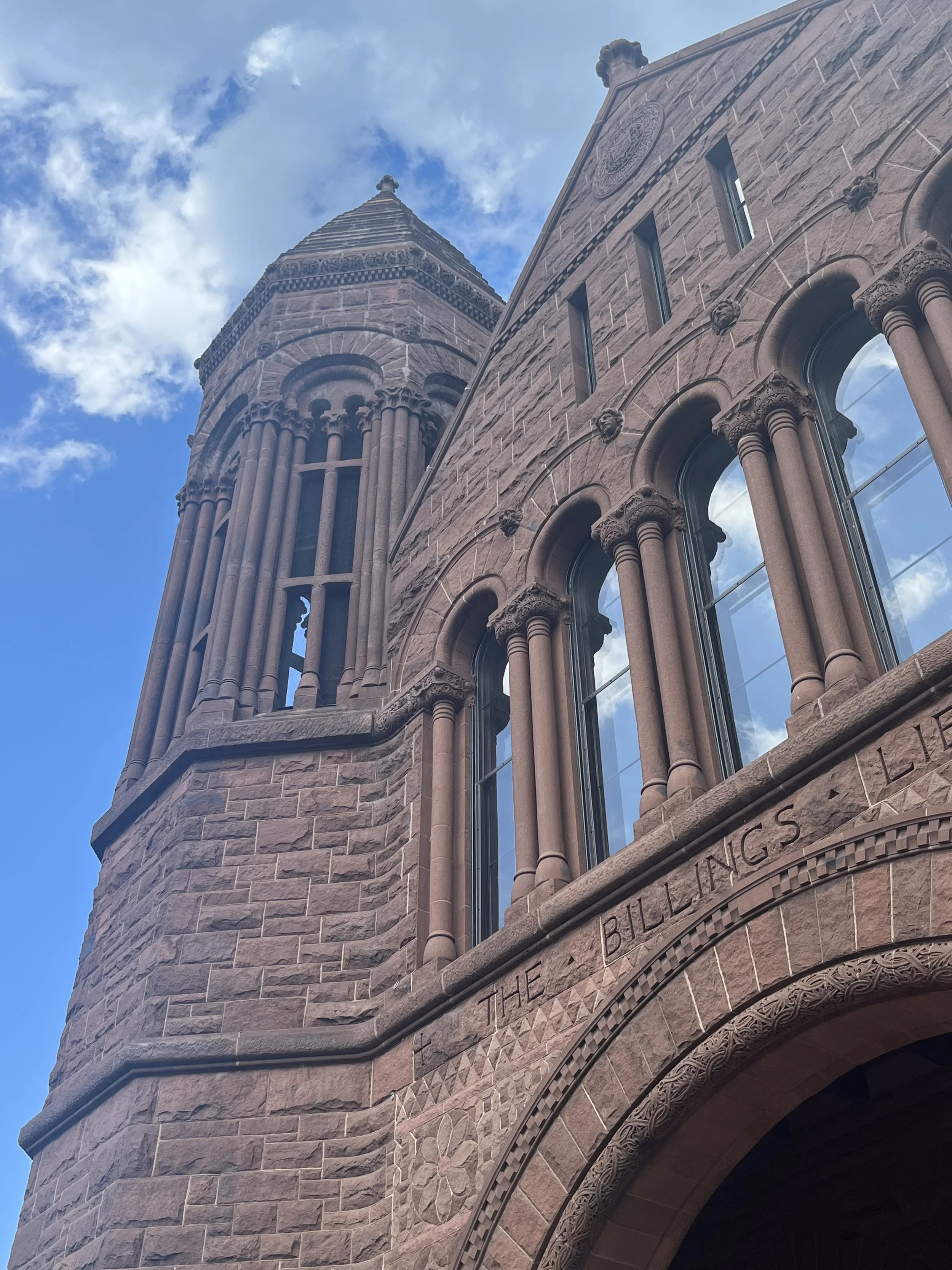
When reviewing architectural plans for the library, Billings originally wrote to the UVM President asking to eliminate the tower belfry. He stated, “If we change that 'pepperbox' which he has in front into a clock tower, we will get about what you and I are thinking of.” However, the octagonal tower stayed, helping to create the iconic image of the building.
Pepperbox Tower/Photo Dianne Kett
Window Groupings
Billings Library strategically uses window groupings to draw the eye in while adequately lighting the interior. The windows on the main horizontal structure are lined up after each other and tucked under the roofline, accentuating the broad stately nature of the design rooted in horizontal lines. In contrast, the entry pavilion features narrow and elongated windows in a group of five, providing dramatic interior light while visually stretching the pavilion upwards.
Window Groupings/Photo by Dianne Kett
Exposed Timber Ceiling and Decorative Woodwork
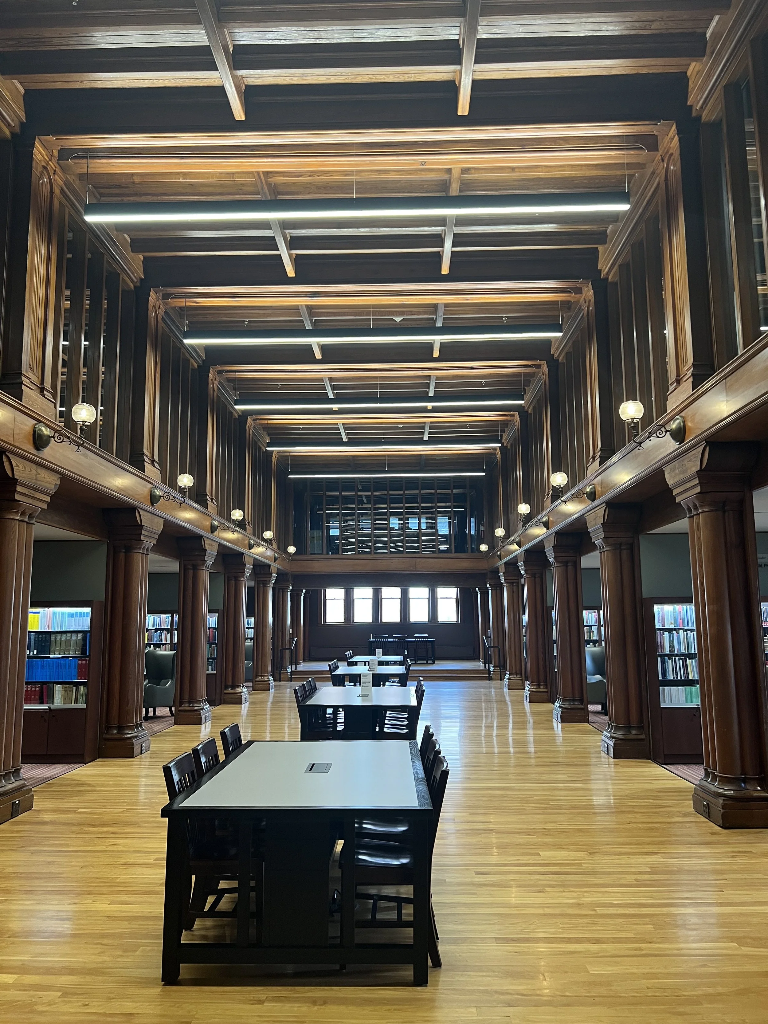
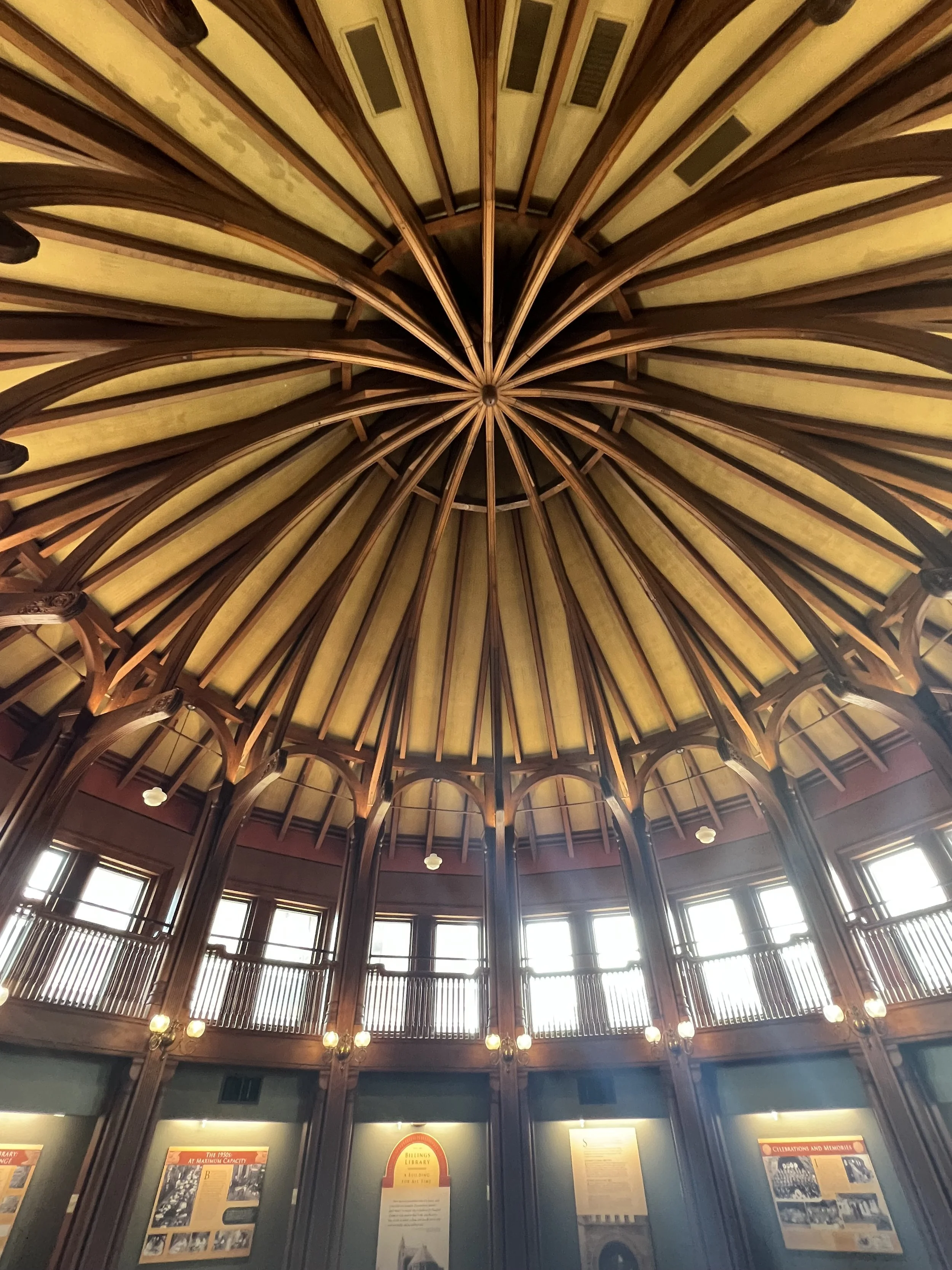
The library's interior is finished with intricate decorative woodwork, including exposed timber ceilings, carved columns, ornamental railings, trim work, and wood floors. All the wood is finished in a uniform medium stain, creating a dramatic and warm effect.
Exposed Timber Ceiling and Decorative Woodwork/Photo by Dianne Kett
The Apse
The exposed timber beam ceiling is best appreciated inside the Apse. The Apse is a polygonal room to the south of the building. Located through a full-height wood archway, the room opens into a circular collection of windows, a full wrap-around balcony, and curved trusses that connect at a central point. The space was originally used as a reading room and has now been restored, so its design can be appreciated for decades to come.
The Apse/Photo by Dianne Kett
Medieval Oversized Fireplace
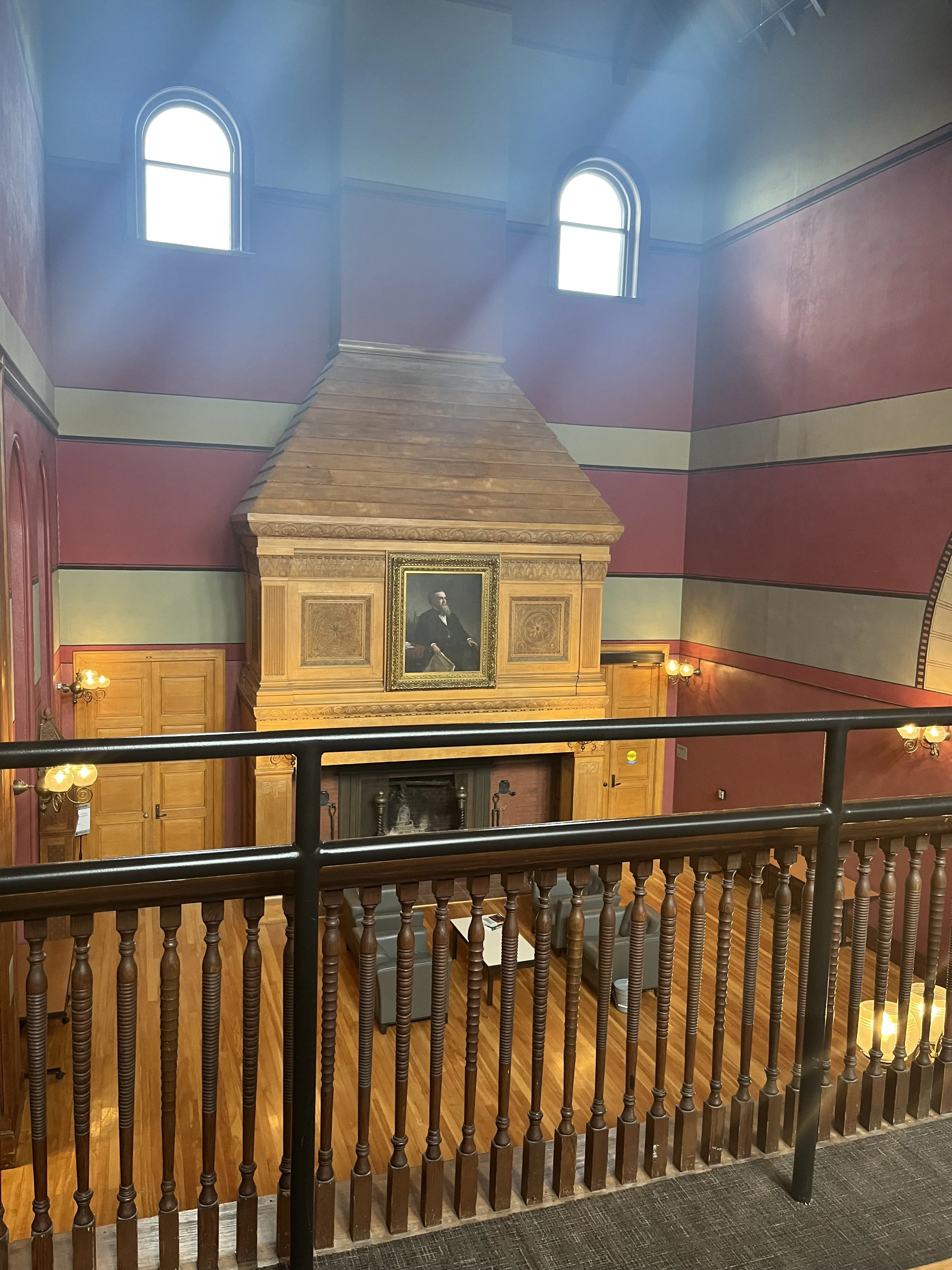
The other side of the library houses a Medieval-style oversized fireplace. The fireplace surround is finished in intricately carved oak because the budget didn’t allow for the originally planned stone surround. Above the mantle hangs a portrait of Billings himself by Vermont artist Thomas Waterman Wood.
Fireplace/Photo by Dianne Kett
Do you have a favorite building?
Want to read another architectural case study?
Check Out Our Blog on The Glass House

