Modern Architecture 101: The Top 5 Mistakes People Make When Designing a Modern Home
Avoid These 5 Mistakes When Building or Renovating Your Modern House
In Austin, our Texas-based architects see a rise in the popularity of modern design elements in residential architecture builds. With more modern-style houses going up, we’ve seen a trend of five major mistakes homeowners and builders are making when designing their modernist-inspired homes. Some of these houses are trying so hard to include modern design elements that they are mixing a variety of clashing forms and forgetting the inspiration behind the modernist movement. Modern design is intended to embrace minimalism, reject ornamentation, and place function first. Here are the top five mistakes to avoid when designing a modern home.
1. Not Understanding the Difference Between Contemporary and Modern Design
The first mistake people tend to make when approaching modern architecture is confusing modern with contemporary design. It is an easy mistake to make because people often use modern and contemporary interchangeably to refer to something new, a structure with clean lines, or a minimalist design.
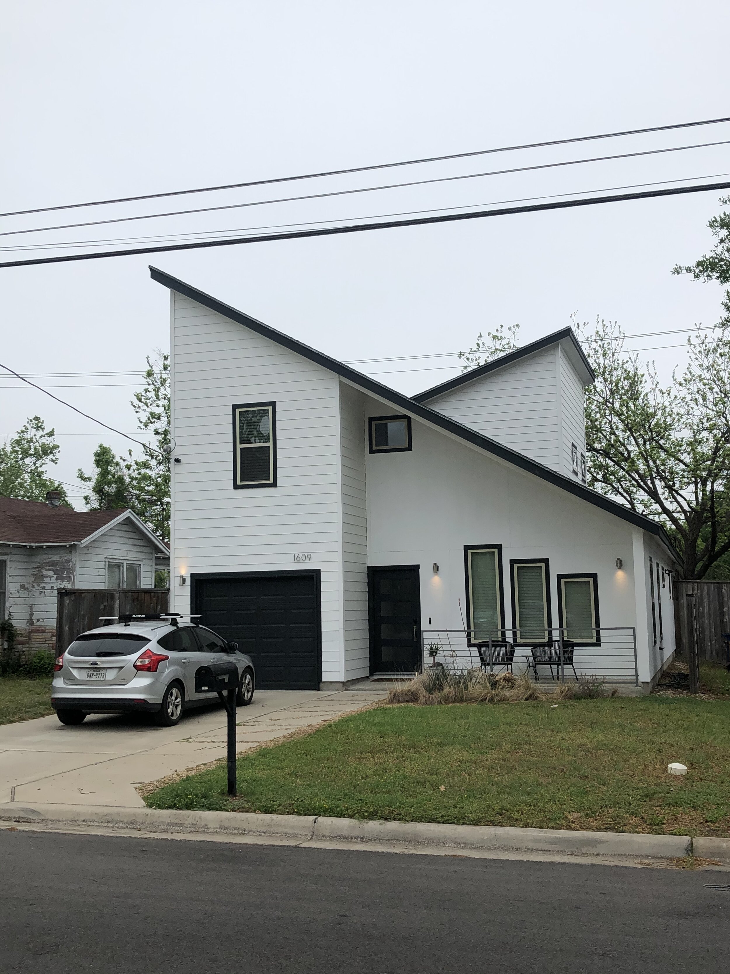
While the two styles share similarities, there is a big difference between modern and contemporary design. Modern design comes from the modernist movement of the mid-1900s and features elements like full-height windows, interesting roof lines, post and beam construction, and a connection to nature. Contemporary design refers to the here and now and is constantly changing. Typically, contemporary architecture includes clean lines, minimalism, and a focus on materials rather than the landscape. Throwing modern design elements, like a butterfly roofline, on a contemporary structure can create a clash. It is important to decide early on if the home style will be modern or contemporary and stick to a plan reflecting the chosen look.
2. Mixing Rustic Elements with Modern Design
In Austin, TX, many homeowners are attempting to capture the vibrant pace of the city with traditional Texas charm by combining elements of rustic and modern design in one home. However, we think it’s best to break up with the modern farmhouse trend altogether. Here are a few elements from farmhouse design that simply don’t go with a modern-style home.
Board and Batten Paneling
Board and batten is an excellent finish for the exterior of a farmhouse, but not a mid-century-inspired home. The material will look too traditional and clash with the clean lines of modern design. Instead, choose a material like painted brick or vertical siding.
Batten Paneling
Tin Metal Roofing
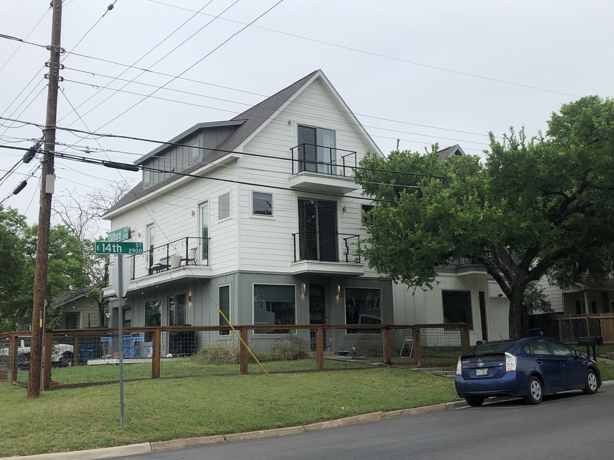
Modernist homes are known for their interesting rooflines, and they often utilize a flat roof construction. Adding a hip or gable roof with tin metal shingles will eliminate the modern feel.
Dormer Windows
While dormer windows are a great way to let in additional light and expand attic space into livable square footage, most mid-century homes only feature single-story floor plans. Dormer windows will throw off the design and again make the overall elevation feel too rustic in appearance.
3. Not Bringing in Natural Elements or Colors
While modern architecture uses sleek materials like metal, concrete, and glass, it remains rooted in nature. Natural colors tie the home back into the environment. Glass panels and sliding doors bring the outdoor spaces inside. Materials like exposed wood beams and stone fireplaces add warmth throughout the design. Far too often, we see a modern approach go cold, which can make a home uninviting and uncomfortable to live in. Avoid these design elements that cut off nature.
Black, White, and Gray Color Palettes
Black, white, and gray color palettes can leave a home feeling cold and void of personality. Modern design as it was intended embraces Earth tone colors like rust, avocado green, and turquoise.
Color Palettes
Small Windows
Small windows can leave a front elevation feeling empty and the interior dark. Modernist homes embrace sunshine and light will full height glass and massive sliding doors.
House with Small Windows
Cold and Manmade Materials
Modern design is about mixing manmade and natural materials for a balanced and warm feel. Try incorporating elements like natural wood and stone.
4. Designing with Incorrect Proportions
In any design style, incorrect proportions can throw off balance and flow. Our Austin architects have noticed that many of the new modern-style homes focus too much on individual elements and not how they work together. Without balanced proportions, your home may look more like a cartoon than a relaxing modern retreat.
Flat Facades
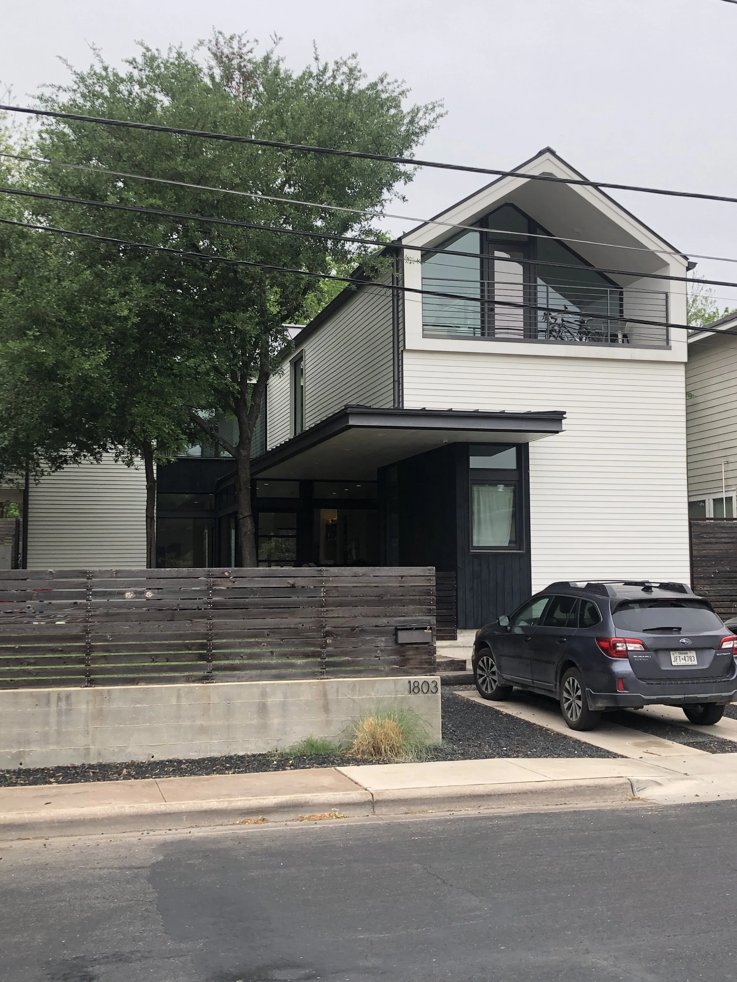
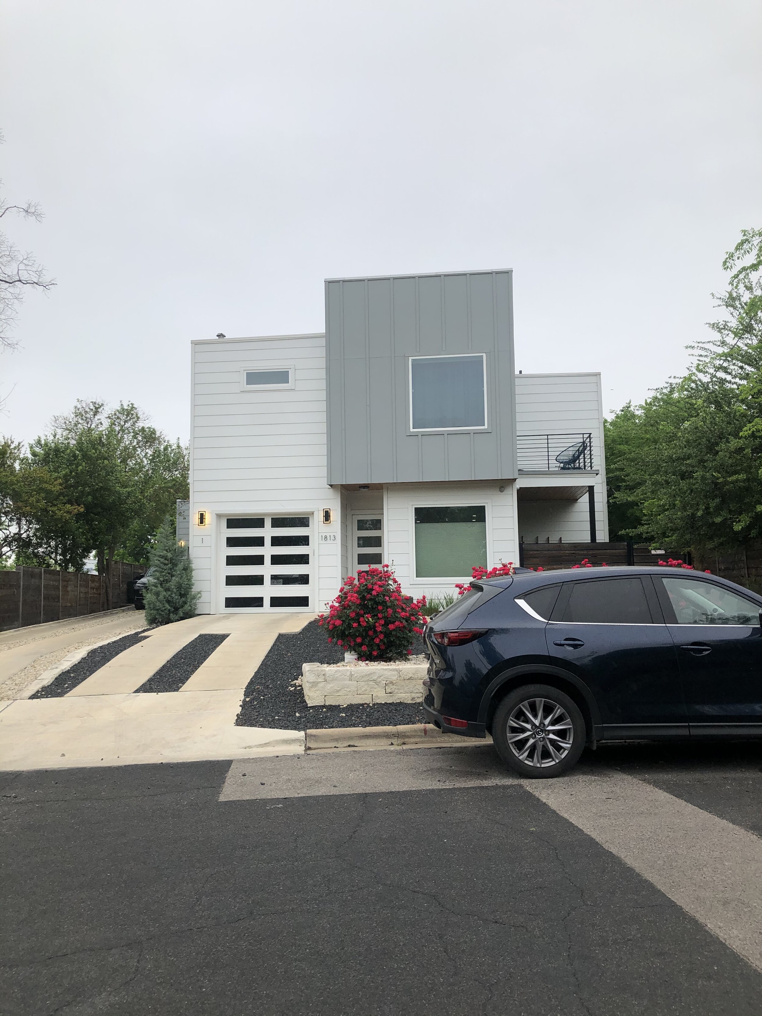
Flat facades lacking dimension can make a home look boxy, boring, and unfinished. While modern design favors clean lines, there should be elements that add variation and texture to the exterior.
Flat Facades
Unbalanced Window Placement
Most newly built modern homes feature oversized picture windows paired with small windows, which often results in uncomfortable negative space. Unintentional window placement can create an unbalanced exterior and improperly lit interior.
Vertical vs. Horizontal Orientation
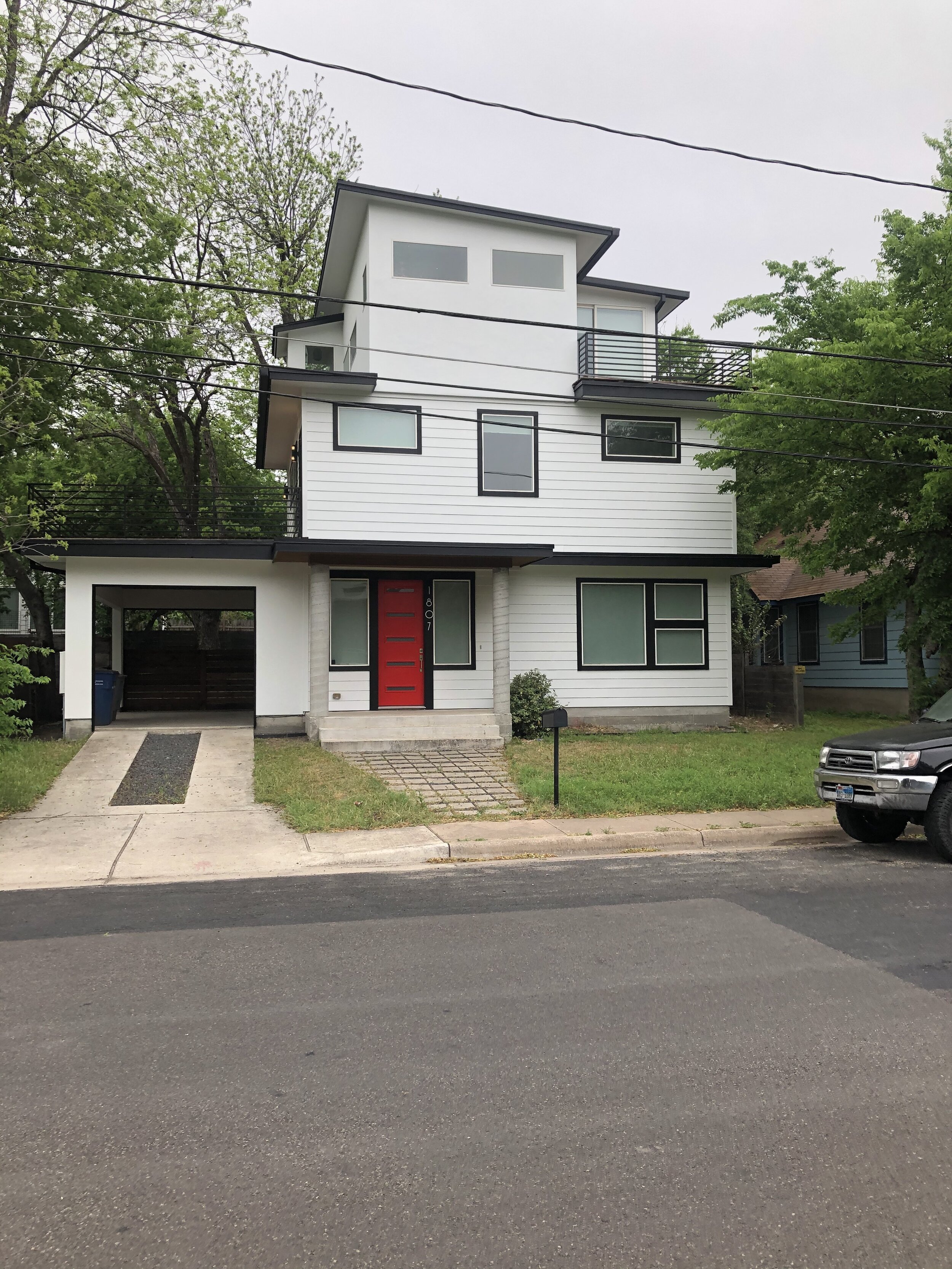
Modernist design from the mid-century tends to favor a single-story build and horizontal lines that echo the horizon line. Horizontally-oriented construction works to connect homes to their environments and is a key feature of modern design. In ever-growing Austin, space restrictions have forced homes into vertical orientations. Without the proper lot size, it is almost impossible to recreate the feel of a modernist house. Many new modern-inspired designs feel off because the horizontal lines are squeezed and stacked into three or more stories.
Vertical vs Horizontal Lines
5. Not Considering the Environment
Finally, some architects feel that poorly designed modern homes make bad neighbors because they neglect to consider the streetscape and landscape in the home’s design. Modern design is intended to connect with nature. Failing to consider the neighbors, the view, and the indoor-outdoor flow will result in a disjointed space and poor design.
Examples of Good Modern Design
When seeking examples of good modern design and architecture, our Texas architects recommend taking inspiration straight from the source! Here are some architects who helped define the modernist movement and popularized many significant design elements that make up modern architecture.
Richard Neutra
Richard Neutra is considered among the most important modernist architects and is famous for designs like the Kaufmann House.
Ray and Charles Eames
Ray and Charles Eames are the husband and wife duo who formed the Eames Office, designing famous structures like the Eames House and furniture pieces like the Eames Lounge Chair.
Frank Lloyd Wright
Frank Lloyd Wright is credited with establishing the Prairie School style, which would later influence the modernist movement and inspire the use of horizontal lines and connections to nature. He is famous for his Fallingwater home.

